20";display:block;height:0;clear:both;visibility:hidden}.clearfix:before,.clearfix:after{content:' 20';display:block;overflow:hidden;visibility:hidden;width:0;height:0}.clearfix:after{clear:both}#Content .fixed-nav{display:none}.fixed-nav{position:fixed;bottom:40px;height:80px;z-index:90}.fixed-nav.fixed-nav-prev{left:0}.fixed-nav.fixed-nav-next{right:0}.fixed-nav .arrow{display:block;width:35px;height:80px;font-size:15px;position:relative;z-index:92;color:#fff;line-height:80px;text-align:center}.fixed-nav .photo{height:80px;width:80px;position:relative;z-index:92;overflow:hidden;line-height:0;background-color:#eee}.fixed-nav .desc{width:190px;padding:6px 15px;min-height:68px;background:#fff;z-index:91}.fixed-nav .desc h6{margin-bottom:0}.fixed-nav .desc i{display:inline-block;margin-right:2px}.fixed-nav .desc i:before{margin-left:0}.fixed-nav .desc .date{display:inline-block;width:100%;padding-top:3px;border-top-width:1px;border-top-style:solid}.fixed-nav-prev .arrow,.fixed-nav-prev .photo,.fixed-nav-prev .desc{float:left}.fixed-nav-prev .desc{margin-left:-335px}.fixed-nav-next .arrow,.fixed-nav-next .photo,.fixed-nav-next .desc{float:right}.fixed-nav-next .desc{margin-right:-335px}@media only screen and (max-width:1430px){.fixed-nav-prev .photo{position:static;margin-left:-115px}.fixed-nav-next .photo{position:static;margin-right:-115px}}#Header_wrapper{position:relative}body:not(.template-slider) #Header_wrapper{background-repeat:no-repeat;background-position:top center}#Header{position:relative}body:not(.template-slider) #Header{min-height:250px}body.header-below:not(.template-slider) #Header{min-height:0}#Header .container{padding-left:var(--mfn-column-gap-left);padding-right:var(--mfn-column-gap-right);box-sizing:border-box}#Top_bar{position:absolute;left:0;top:61px;width:100%;border-bottom:1px solid transparent;z-index:30}#Top_bar .column{display:flex;margin-bottom:0}#Top_bar .top_bar_left{position:relative;float:left;width:100%}#Top_bar .logo{float:left;margin:0 30px 0 20px}#Top_bar #logo{display:block;height:60px;line-height:60px;padding:15px 0;box-sizing:content-box}#Top_bar #logo img{vertical-align:middle;max-height:100%}#Top_bar #logo img.logo-sticky,#Top_bar #logo img.logo-mobile,#Top_bar #logo img.logo-mobile-sticky{display:none}#Top_bar .menu_wrapper{float:left;z-index:201}#Top_bar .secondary_menu_wrapper{display:none}#Top_bar a.responsive-menu-toggle{display:none;position:absolute;right:15px;top:50%;margin-top:-17px;width:34px;height:34px;text-align:center;border-radius:3px;z-index:200}#Top_bar a.responsive-menu-toggle i{font-size:22px;line-height:34px}#Top_bar .search_wrapper{position:absolute;left:50%;transform:translateX(-50%);top:calc(100% + 40px);display:none;z-index:205;width:100%;box-sizing:border-box;width:600px;max-width:80%;overflow:hidden}#Top_bar .search_wrapper>form{position:relative}#Top_bar .search_wrapper input[type=text]{width:100%;margin:0;box-sizing:border-box;-webkit-box-shadow:0 0 0;box-shadow:0 0 0;padding:22px 30px 22px 60px;background:0 0;border-width:0;font-size:15px;color:rgba(0,0,0,.8)}#Top_bar .search_wrapper .icon_search,#Top_bar .search_wrapper .icon_close{position:absolute;top:50%;transform:translateY(-50%)}#Top_bar .search_wrapper .icon_search{left:15px}#Top_bar .search_wrapper .icon_close{right:10px}#Top_bar .search_wrapper{background-color:#fff;box-shadow:0px 10px 46px 0px rgba(1,7,39,.1);border-radius:4px}#Top_bar .top_bar_right{float:right;position:relative;padding:0 20px;flex-shrink:0}#Top_bar .top_bar_right .top_bar_right_wrapper{display:flex;align-items:center;height:100%}#Top_bar .top_bar_right .top-bar-right-icon{display:flex;align-items:center;margin:0 5px;line-height:0;font-size:20px;text-decoration:none}#Top_bar .top_bar_right .top_bar_right_wrapper>a:last-child{margin-right:0}#Top_bar .top_bar_right .top-bar-right-icon svg{width:26px}#Top_bar .top_bar_right .top-bar-right-icon svg .path{stroke:#444}#Top_bar #menu{z-index:201}#Top_bar .menu{z-index:202}#Top_bar .menu>li{margin:0;z-index:203;display:block;float:left}#Top_bar .menu>li:not(.mfn-megamenu-parent){position:relative}#Top_bar .menu>li>a{display:block;line-height:60px;padding:15px 0;position:relative}#Top_bar .menu>li>a:not(.menu-toggle):after{content:"";height:4px;width:100%;position:absolute;left:0;top:-4px;z-index:203;opacity:0}#Top_bar .menu>li>a span:not(.description){display:block;line-height:60px;padding:0 20px;white-space:nowrap;border-right-width:1px;border-style:solid}#Top_bar .menu>li:last-child>a span{border:0}#Top_bar .menu li ul{position:absolute;left:0;top:100%;z-index:205;margin:0;display:none;background-image:url(/web/wp-content/themes/betheme/images/box_shadow.png);background-repeat:repeat-x;background-position:left top}#Top_bar .menu li>ul{box-shadow:2px 2px 2px 0 rgba(0,0,0,.03);-webkit-box-shadow:2px 2px 2px 0 rgba(0,0,0,.03)}#Top_bar .menu li ul li{padding:0;width:200px;position:relative;font-weight:400}#Top_bar .menu li ul li a{padding:10px 20px;display:block;border-bottom:1px solid rgba(0,0,0,.05)}#Top_bar .menu li ul li a span{display:inline-block;position:relative}.header-below #Header .top_bar_left,.header-below #Header .top_bar_right{background-color:transparent}.header-below #Top_bar{position:static;background-color:#fff}.header-below #Top_bar .top_bar_right{top:0}.header-below #Top_bar .top_bar_right:before{display:none}#body_overlay{position:fixed;top:0;left:0;width:100%;height:120%;background:rgba(0,0,0,.6);z-index:9002;display:none}#Subheader{background-color:rgba(0,0,0,.02);background-position:center top;background-repeat:no-repeat;padding:30px 0;position:relative}#Subheader .title{margin-bottom:0;width:70%;float:left}#Subheader ul.breadcrumbs{display:block;width:30%;margin:1px 0 0;font-size:1em!important;float:right;text-align:right}#Subheader ul.breadcrumbs li{display:inline-block}#Subheader ul.breadcrumbs li,#Subheader ul.breadcrumbs li a{color:rgba(0,0,0,.3)}#Subheader ul.breadcrumbs li span{margin:0 10px;opacity:.4}#Subheader:after{content:"";height:3px;width:100%;display:block;position:absolute;left:0;bottom:-3px;z-index:1;box-shadow:inset 0px 4px 3px -2px rgba(0,0,0,.06)}.post-nav{padding:10px 15px 4px 130px;margin-bottom:20px;background-image:url(/web/wp-content/themes/betheme/images/stripes/stripes_5_b.png);-webkit-box-sizing:border-box;-moz-box-sizing:border-box;box-sizing:border-box;overflow:hidden}.post-nav .next-prev-nav{float:left}.post-nav .next-prev-nav li{float:left;margin-right:5px}.post-nav .next-prev-nav a.button{margin:0}.post-header{margin-bottom:20px}.post-header .button-love{width:99px;float:left;text-align:center}.post-header .button-love a.mfn-love{display:inline-block;position:relative;padding-left:28px;font-size:17px;margin-top:25px}.post-header .button-love a.mfn-love i{position:absolute;left:0;top:0;font-size:18px}.post-header .button-love a.mfn-love i:last-child{opacity:0}.post-header .title_wrapper{margin-left:99px;border-left-width:1px;border-style:solid;padding-left:30px}.post-header .title_wrapper h1{font-size:35px;line-height:35px}.single-photo-wrapper .share_wrapper{float:left}.single-photo-wrapper .image_frame{margin-left:120px}.single-photo-wrapper.image{text-align:center}.single-photo-wrapper.image .image_frame{margin-left:0;display:inline-block}.section-post-header .single-photo-wrapper.image .image_frame{max-width:80%;max-width:calc(100% - 130px)}.share_wrapper{background:#fff;border-width:1px;border-style:solid;width:98px;text-align:center;padding:10px 0 5px}#respond p{margin-bottom:15px;padding-left:0!important}#respond label{margin-bottom:3px}.image_frame{display:block;overflow:hidden;margin:0;border-style:solid;border-width:0;max-width:100%;line-height:0;box-sizing:border-box}.image_frame .image_wrapper{box-sizing:border-box}.image_frame .image_wrapper{position:relative;overflow:hidden}.image_frame .image_wrapper img:not(.ls-l){position:relative;top:0;-webkit-transform:scale(1);-moz-transform:scale(1);-o-transform:scale(1);transform:scale(1)}form{margin-bottom:0}textarea{min-height:60px;line-height:20px}label{display:block;margin-bottom:5px;font-weight:500}input[type=text],textarea{padding:10px;outline:none;margin:0;width:230px;max-width:100%;display:block;margin-bottom:20px;font-size:15px;border-width:1px;border-style:solid;border-radius:0;box-sizing:border-box;-webkit-appearance:none}ul{list-style:none outside}input[type=text],textarea,.share_wrapper,.post-header .title_wrapper,.fixed-nav .desc .date{border-color:rgba(0,0,0,.08)}input[type=text],textarea{background-color:#fff;color:#626262;box-shadow:inset 0 0 2px 2px rgba(0,0,0,.02)}#Top_bar .menu>li>a span{border-color:rgba(0,0,0,.05)}.image_frame{border-color:#f8f8f8}.image_frame .image_wrapper{border-color:#e2e2e2}.mfn-close-icon{z-index:5;display:flex;justify-content:center;align-items:center;width:40px;height:40px;font-size:20px;text-decoration:none!important}.mfn-close-icon .icon{color:rgba(0,0,0,.3);display:inline-block}.section_wrapper{display:flex;align-items:flex-start;flex-wrap:wrap}body{--mfn-swiper-pagination-bullet-active-color:#007aff;--mfn-swiper-pagination-bullet-inactive-color:#000;--mfn-swiper-pagination-bullet-width:10px;--mfn-swiper-pagination-bullet-height:10px;--mfn-swiper-pagination-spacing:20px;--mfn-swiper-arrow-width:auto;--mfn-swiper-arrow-height:auto;--mfn-swiper-arrow-size:50px;--mfn-swiper-arrow-spacing:20px}body{--mfn-tabs-border-width:1px}html,body{overflow-x:hidden}@media only screen and (min-width:960px) and (max-width:1239px){body{min-width:0}#Wrapper{max-width:960px}.section_wrapper,.container{max-width:940px}}@media only screen and (max-width:959px){.section{background-attachment:scroll!important}}@media only screen and (min-width:768px) and (max-width:959px){body{min-width:0}#Wrapper{max-width:728px}.section_wrapper,.container{max-width:708px}#Subheader .title{width:100%}#Subheader ul.breadcrumbs{display:none}}@media only screen and (max-width:767px){body{min-width:0}#Wrapper{max-width:90%;max-width:calc(100% - 67px)}.section_wrapper .column,.container .column{margin:0;width:100%;clear:both}.sections_group{margin:0;width:100%!important;clear:both}.content_wrapper .section_wrapper,.container{max-width:700px!important;padding-left:33px!important;padding-right:33px!important}.content_wrapper .mcb-column-inner{margin:0 0 20px;height:auto!important}body:not(.mobile-sticky) .header_placeholder{height:0!important}#Top_bar{background-color:#fff!important;position:static}#Top_bar .container{max-width:100%!important;padding:0!important}#Top_bar .column{flex-wrap:wrap}#Top_bar .top_bar_left{float:none;width:100%!important;background:none!important}#Top_bar .top_bar_right{width:100%}#Top_bar a.responsive-menu-toggle{top:40px;right:10px}#Top_bar .menu_wrapper{float:left!important;width:100%;margin:0!important}#Top_bar #menu{float:left;position:static!important;width:100%!important}#Top_bar .logo{position:static;float:left;width:100%;text-align:center;margin:0}#Top_bar .logo #logo{padding:0!important;margin:10px 50px}#Top_bar #logo img.logo-main{display:none}#Top_bar #logo img.logo-mobile{display:inline-block}#Top_bar #logo img.logo-mobile-sticky{display:none}#Top_bar .top_bar_right{float:none;padding:5px 10px}#Top_bar .top_bar_right .top_bar_right_wrapper{flex-wrap:wrap;justify-content:center}#Top_bar .top_bar_right .top-bar-right-icon{margin:5px}#Top_bar .search_wrapper{z-index:10000}.mobile-tb-left #Top_bar .top_bar_right .top_bar_right_wrapper{justify-content:flex-start}.mobile-icon-search-ss #Top_bar .top-bar-right-icon-search{display:none!important}body.header-below:not(.template-slider) #Header{padding-top:0!important}#Subheader .title{width:100%}#Subheader ul.breadcrumbs{display:none}.post-header .button-love{width:69px}.post-header .title_wrapper{margin-left:69px;padding-left:20px}.post-header .title_wrapper h1{font-size:27px;line-height:27px}.single-photo-wrapper .image_frame{max-width:100%!important;margin-left:0}.single-photo-wrapper .share_wrapper{float:none;padding:5px 15px 0;margin-bottom:20px;width:auto}.post-nav{padding:10px 10px 4px 90px}.image_frame{margin-top:0!important}.fixed-nav{display:none!important}}@media only screen and (max-width:479px){.post-nav{padding:10px 10px 4px}}html{background-color:#fcfcfc}#Wrapper,#Content,#Top_bar .search_wrapper{background-color:#f8f8f8}body:not(.template-slider) #Header{min-height:0px}body.header-below:not(.template-slider) #Header{padding-top:0}body,input[type=submit],input[type=text],textarea{font-family:"Raleway",-apple-system,BlinkMacSystemFont,"Segoe UI",Roboto,Oxygen-Sans,Ubuntu,Cantarell,"Helvetica Neue",sans-serif}#menu>ul>li>a{font-family:"Raleway",-apple-system,BlinkMacSystemFont,"Segoe UI",Roboto,Oxygen-Sans,Ubuntu,Cantarell,"Helvetica Neue",sans-serif}#Subheader .title{font-family:"Julius Sans One",-apple-system,BlinkMacSystemFont,"Segoe UI",Roboto,Oxygen-Sans,Ubuntu,Cantarell,"Helvetica Neue",sans-serif}h1,h3{font-family:"Julius Sans One",-apple-system,BlinkMacSystemFont,"Segoe UI",Roboto,Oxygen-Sans,Ubuntu,Cantarell,"Helvetica Neue",sans-serif}h6{font-family:"Julius Sans One",-apple-system,BlinkMacSystemFont,"Segoe UI",Roboto,Oxygen-Sans,Ubuntu,Cantarell,"Helvetica Neue",sans-serif}body{font-size:16px;line-height:24px;font-weight:400;letter-spacing:0px}#menu>ul>li>a{font-size:16px;font-weight:400;letter-spacing:1px}#Subheader .title{font-size:28px;line-height:42px;font-weight:400;letter-spacing:0px}h1{font-size:30px;line-height:40px;font-weight:500;letter-spacing:0px}h3{font-size:23px;line-height:35px;font-weight:500;letter-spacing:0px}h6{font-size:13px;line-height:19px;font-weight:300;letter-spacing:0px}@media only screen and (min-width:768px) and (max-width:959px){body{font-size:16px;line-height:24px;font-weight:400;letter-spacing:0px}#menu>ul>li>a{font-size:16px;font-weight:400;letter-spacing:1px}#Subheader .title{font-size:28px;line-height:42px;font-weight:400;letter-spacing:0px}h1{font-size:30px;line-height:40px;font-weight:500;letter-spacing:0px}h3{font-size:23px;line-height:35px;font-weight:500;letter-spacing:0px}h6{font-size:13px;line-height:19px;font-weight:300;letter-spacing:0px}}@media only screen and (min-width:480px) and (max-width:767px){body{font-size:16px;line-height:24px;font-weight:400;letter-spacing:0px}#menu>ul>li>a{font-size:16px;font-weight:400;letter-spacing:1px}#Subheader .title{font-size:28px;line-height:42px;font-weight:400;letter-spacing:0px}h1{font-size:30px;line-height:40px;font-weight:500;letter-spacing:0px}h3{font-size:23px;line-height:35px;font-weight:500;letter-spacing:0px}h6{font-size:13px;line-height:19px;font-weight:300;letter-spacing:0px}}@media only screen and (max-width:479px){body{font-size:16px;line-height:24px;font-weight:400;letter-spacing:0px}#menu>ul>li>a{font-size:16px;font-weight:400;letter-spacing:1px}#Subheader .title{font-size:28px;line-height:42px;font-weight:400;letter-spacing:0px}h1{font-size:30px;line-height:40px;font-weight:500;letter-spacing:0px}h3{font-size:23px;line-height:35px;font-weight:500;letter-spacing:0px}h6{font-size:13px;line-height:19px;font-weight:300;letter-spacing:0px}}@media only screen and (min-width:1240px){#Wrapper{max-width:1240px}.section_wrapper,.container{max-width:1220px}}@media only screen and (max-width:767px){.content_wrapper .section_wrapper,.container{max-width:550px!important}}.button-default .button{background-color:#f7f7f7;color:#747474}.button-default input[type=submit]{color:#fff}#Top_bar #logo{height:60px;line-height:60px;padding:15px 0}#Top_bar .menu>li>a{padding:15px 0}.image_frame{border-width:0}@media only screen and (min-width:1240px){body:not(.header-simple) #Top_bar #menu{display:block!important}}@media only screen and (min-width:768px) and (max-width:1240px){.header_placeholder{height:0!important}}@media only screen and (max-width:1239px){#Top_bar #menu{display:none;height:auto;width:300px;bottom:auto;top:100%;right:1px;position:absolute;margin:0}#Top_bar a.responsive-menu-toggle{display:block}#Top_bar #menu>ul{width:100%;float:left}#Top_bar #menu ul li{width:100%;padding-bottom:0;border-right:0;position:relative}#Top_bar #menu ul li a{padding:0 25px;margin:0;display:block;height:auto;line-height:normal;border:none}#Top_bar #menu ul li a:not(.menu-toggle):after{display:none}#Top_bar #menu ul li a span{border:none;line-height:44px;display:inline;padding:0}#Top_bar #menu ul li a span:after{display:none!important}#Top_bar #menu ul li ul{position:relative!important;left:0!important;top:0;padding:0;margin-left:0!important;width:auto!important;background-image:none!important;box-shadow:0 0 0 0 transparent!important;-webkit-box-shadow:0 0 0 0 transparent!important}#Top_bar #menu ul li ul li{width:100%!important}#Top_bar #menu ul li ul li a{padding:0 20px 0 35px}#Top_bar #menu ul li ul li a span{padding:0}#Top_bar #menu ul li ul li a span:after{display:none!important}}body{--mfn-clients-tiles-hover:#b5bfc2;--mfn-icon-box-icon:#9eaaae;--mfn-sliding-box-bg:#9eaaae;--mfn-woo-body-color:#0e1518;--mfn-woo-heading-color:#0e1518;--mfn-woo-themecolor:#b5bfc2;--mfn-woo-bg-themecolor:#b5bfc2;--mfn-woo-border-themecolor:#b5bfc2}#Header_wrapper{background-color:#0e1518}#Subheader{background-color:rgba(247,247,247,0)}body{color:#0e1518}.button-love a.mfn-love{color:#b5bfc2}.fixed-nav .arrow{background-color:#b5bfc2}a{color:#6a7f86}.button-love a .label,.fixed-nav .desc .date{color:#2e4046}h1{color:#0e1518}h3,h3 a{color:#0e1518}h6{color:#0e1518}.button-default input[type=submit]{background-color:#b5bfc2}#Header .top_bar_left,.header-below #Top_bar,#Top_bar #menu{background-color:#f8fafa}#Top_bar .top_bar_right:before{background-color:#e3e3e3}#Header .top_bar_right{background-color:#f5f5f5}#Top_bar .top_bar_right .top-bar-right-icon,#Top_bar .top_bar_right .top-bar-right-icon svg .path{color:#3c555e;stroke:#3c555e}#Top_bar .menu>li>a{color:#444}#Top_bar .menu>li a:not(.menu-toggle):after{background:#b5bfc2}#Top_bar .menu>li ul{background-color:#f2f2f2}#Top_bar .menu>li ul li a{color:#5f5f5f}#Top_bar .responsive-menu-toggle{color:#2991d6;background:0 0}#Subheader .title{color:#888}#Subheader ul.breadcrumbs li,#Subheader ul.breadcrumbs li a{color:rgba(136,136,136,.6)}.image_frame{border-color:#f8f8f8}input[type=text],textarea{color:#626262;background-color:rgba(255,255,255,1);border-color:#ebebeb}::-webkit-input-placeholder{color:#929292}::-moz-placeholder{color:#929292}:-ms-input-placeholder{color:#929292}:focus::-webkit-input-placeholder{color:#929292}:focus::-moz-placeholder{color:#929292}@media only screen and (max-width:767px){#Top_bar{background-color:#f8fafa!important}}form input.display-none{display:none!important}body{--mfn-featured-image:url(https://malpicaquintero.com/web/wp-content/uploads/2016/11/tendencias-2017.jpg)}#Subheader{display:none}li a,a:visited{text-decoration:underline;font-weight:900}nav a,a:visited{text-decoration:none}:root{--swiper-theme-color:#007aff}:root{--swiper-navigation-size:44px}:root{--jp-carousel-primary-color:#fff;--jp-carousel-primary-subtle-color:#999;--jp-carousel-bg-color:#000;--jp-carousel-bg-faded-color:#222;--jp-carousel-border-color:#3a3a3a}:root{--jetpack--contact-form--border:1px solid #8c8f94;--jetpack--contact-form--border-color:#8c8f94;--jetpack--contact-form--border-size:1px;--jetpack--contact-form--border-style:solid;--jetpack--contact-form--border-radius:0px;--jetpack--contact-form--input-padding:16px;--jetpack--contact-form--font-size:16px;--jetpack--contact-form--error-color:#b32d2e;--jetpack--contact-form--inverted-text-color:#fff}#likes-other-gravatars{background-color:#2e4453;border-width:0;box-shadow:0 0 10px #2e4453;box-shadow:0 0 10px #2e445399;display:none;min-width:130px;padding:10px 10px 12px;position:absolute;z-index:1000}#likes-other-gravatars.wpl-new-layout{background-color:#fff;border:1px solid #dcdcde;border-radius:4px;box-shadow:none;display:none;height:auto;max-height:240px;min-width:220px;overflow:auto;padding:9px 12px 10px;position:absolute;z-index:1000}#likes-other-gravatars *{line-height:normal}#likes-other-gravatars .likes-text{color:#fff;font-size:12px;padding-bottom:8px}#likes-other-gravatars.wpl-new-layout .likes-text{color:#101517;font-size:12px;font-weight:500;padding-bottom:8px}#likes-other-gravatars ul{list-style-type:none;margin:0;padding:0;text-indent:0}#likes-other-gravatars ul.wpl-avatars{display:block;max-height:190px;overflow:auto}.post-likes-widget-placeholder .button{display:none}#jp-relatedposts{clear:both;display:none;margin:1em 0;padding-top:1em;position:relative}.jp-relatedposts:after{clear:both;content:"";display:block}#jp-relatedposts h3.jp-relatedposts-headline{display:inline-block;float:left;font-family:inherit;font-size:9pt;font-weight:700;margin:0 0 1em}#jp-relatedposts h3.jp-relatedposts-headline em:before{border-top:1px solid #0003;content:"";display:block;margin-bottom:1em;min-width:30px;width:100%}#jp-relatedposts h3.jp-relatedposts-headline em{font-style:normal;font-weight:700}.path{fill:none;stroke:#000;stroke-miterlimit:10;stroke-width:1.5px}.path{fill:none;stroke:#000;stroke-miterlimit:10;stroke-width:1.5px}.path{fill:none;stroke:#333;stroke-miterlimit:10;stroke-width:1.5px}.path{fill:none;stroke:#333;stroke-miterlimit:10;stroke-width:1.5px}.gglcptch_error_text{color:red;display:none}
¿Es posible medir el ROI de un proyecto de identidad corporativa? – Rhandus Malpica Quintero
¿Cómo se mide el éxito de un proyecto de identidad corporativa? Esta es una pregunta interesante de responder y es así, dado que muchos ejecutivos de diferentes empresas lo ven como un gasto y no como lo que realmente es, una inversión.
Es posible que como diseñadores debamos convencer a nuestros clientes sobre los beneficios de una imagen corporativa coherente y el impacto que esta puede llegar a tener para la proyección de sus negocios. Navegando por la web encontré un informe que da luces importantes sobre este tipo de discurso y recursos de medición.
El ROI del diseño El estudio fue realizado en Finlandia entre septiembre de 2011 y septiembre de 2012 por un grupo de investigadores de la Universidad de Aalto. El objetivo era desarrollar un modelo y un conjunto de métricas para medir el retorno de la inversión del diseño corporativo.
Se focalizó en analizar la identidad de marca, desde un nivel básico, el estudio cualitativo utilizó encuestas para analizar apropiadamente la satisfacción del usuario, la conveniencia, la estética. Luego se consideraron otras métricas cuantitativas como el número de nuevos clientes, menciones, «fans» en las redes sociales, y el número de visitas o registros al sitio web.
Es resultado final es el desarrollo de una propuesta para la implementación de un “marco para el ROI del diseño” que pude ser una excelente referencia para cualquier ejecutivo encargado del posicionamiento de su marca. Considera el informe que los temas relacionados con el ROI del diseño es muy extensos y multifacéticos, así como de gran importancia para la sociedad, por lo que su investigación y desarrollo sistemático son muy importantes.
Hay que considerar que si usted desea obtener un informe completo, debe considerar realizar un seguimiento de los indicadores antes y después (hay empresas que se especializan en la realización de encuestas y podrían ayudarlo), mientras más tiempo usted invierta en el «antes», más fácil va a ser para usted medir el impacto del «después». Por supuesto, no todos los clientes tienen el tiempo o el presupuesto para hacer esto correctamente.
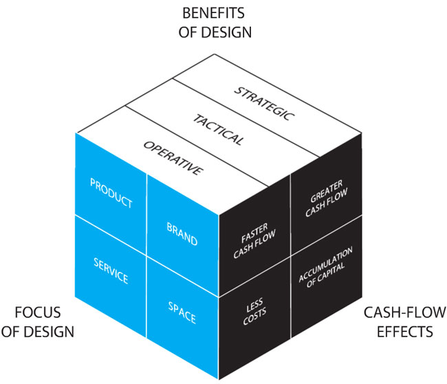
Diseño marco retorno de la inversión (propuesta del informe)
Hay muchas cosas que considerar en (143 páginas), y definitivamente no nos dará todas las respuestas, pero es un primer e interesante paso para construir un discurso con mucho sentido en relación al este concepto.
Puede ver el informe completo en el siguiente enlace >>
Me gusta esto: Me gusta Cargando...
¿Qué es usabilidad y por qué debo invertir en ella? 09/05/2016
Principios del diseño de aplicaciones móviles – #GoogleIO2016 23/05/2016
¿Qué es usabilidad y por qué debo invertir en ella? 09/05/2016
Principios del diseño de aplicaciones móviles – #GoogleIO2016 23/05/2016